Trane Technologies Temporary Override
Designing a new smart thermostat feature from survey insight to stakeholder-approved prototype — in two weeks.
Role: XD Designer
Duration: 2 week sprint
Completed: Nov 2022
Tools: Figma, Protopie, Photoshop, Illustrator
Skills: Journey Mapping, Interaction Design, Lo-fi Wireframing, Rapid Prototyping, Stakeholder Presentation
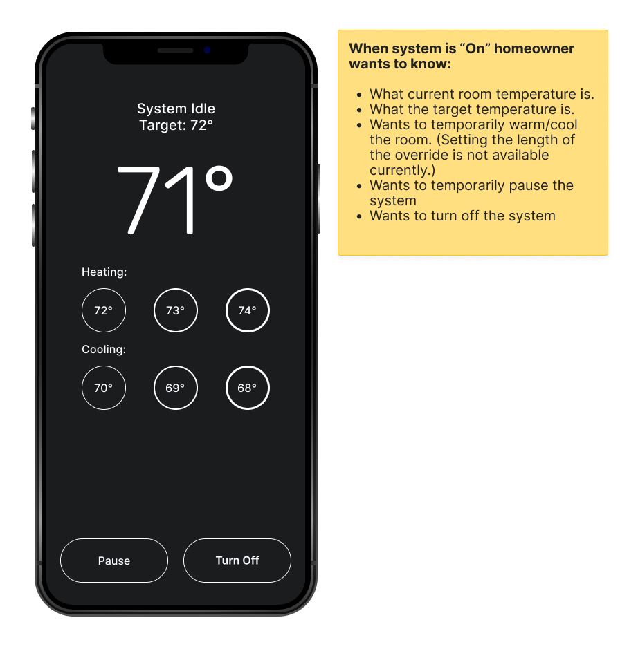
Challenge
Trane's product users had been asking for the same thing: a way to temporarily adjust their home temperature without disrupting their regular schedule. A survey confirmed this was a priority. My challenge was to design a new feature — Temporary Override — within a two-week sprint, moving from research and journey mapping to a stakeholder-ready prototype without an existing design library to build from.
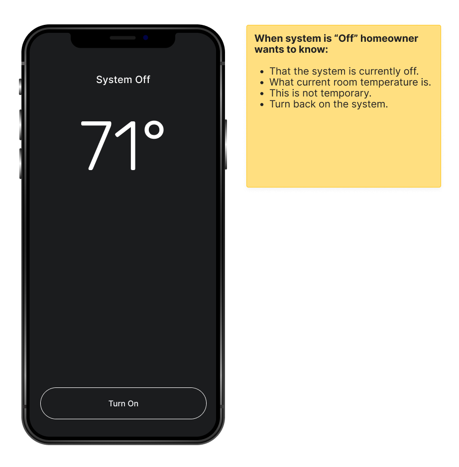
The Problem
Use Case: Angela is preparing for a movie night with friends and family. She wants to temporarily cool down her home for a few hours while guests are over so everyone is more comfortable and have it return to her regular scheduled routine after her guest has left.
With the current mobile app Angela has two paths to approach this scenario.
Lower the temperature via the home screen.
Go into scheduling and edit the temperature setpoints.
Both options end up being permanent edits to the thermostat and that was only one of the many example use cases to warrant building this feature.
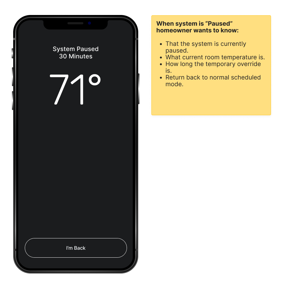
Journey Mapping
To build shared understanding across the team, I created a journey map tracing Angela's experience from realizing she wants to adjust her temperature to confirming her schedule is back to normal after guests leave. Mapping it end-to-end surfaced where her confidence dropped: she didn't trust that her regular schedule would return on its own, and had no way to confirm the override was active or how long it would last.
From a team discussion of the map, we extracted six key feature needs — ranging from viewing current temperature to temporarily pausing the HVAC — and used those as the design brief for lo-fi wireframes. Starting from user needs rather than interface assumptions kept the early designs focused.
Journey Map

Key Feature Needs
Design Process
Building From Scratch
Since the app was undergoing a complete overhaul, there was no established design library to reference. From both a UX Designer and Developer perspective, this gave me the freedom to prioritize functionality and focus on the user experience rather than being slowed down by visual elements.
An additional benefit of using simple design elements was the ability to quickly generate a large number of different designs and workflows to explore. This approach allowed me to:
Innovate and experiment with ideas that might have otherwise been overlooked.
Build a deeper understanding of the product.
Identify better solutions that were missed in earlier discussions.
After two days and dozens of iterations, followed by discussions with my team lead, I settled on functional screens that met the key feature requirements while keeping the workflow as streamlined as possible."
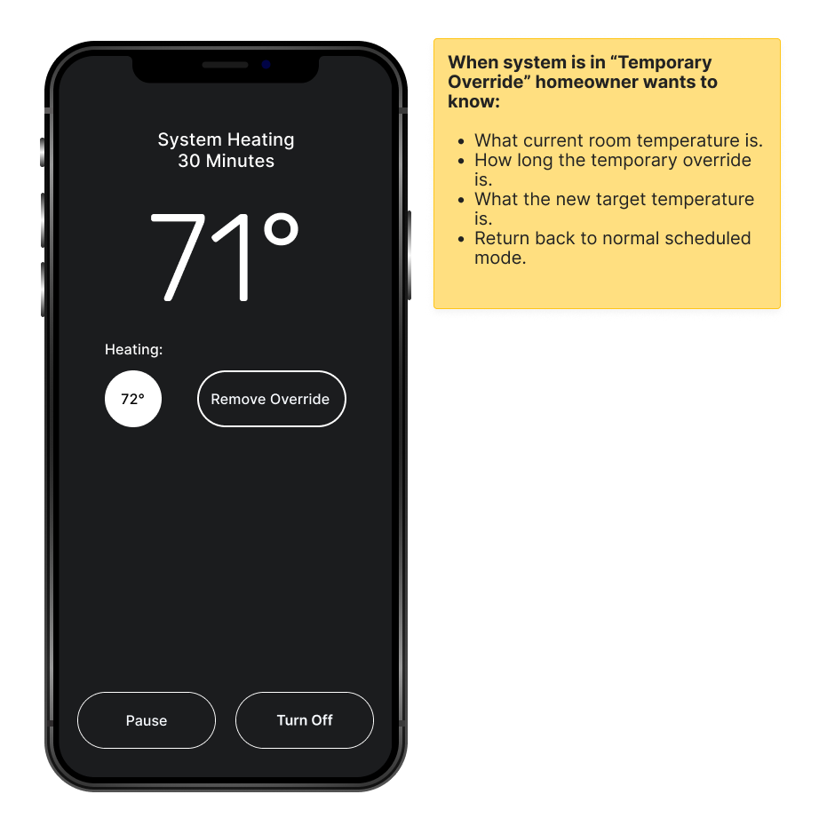
Prototype & Presentation
Figma handled both the design library and prototype linking — after a day of connecting screens and testing flows, the MVP was ready for stakeholder review. The prototype's goal was never visual polish: it was proof that the feature worked as intended, that Angela could cool her home for a few hours and trust her schedule would return on its own.
Before the demo, I set context for the room: this is a functionality prototype, not a final design; evaluate it as a homeowner who wants a temporary adjustment, not as a designer. That framing consistently focuses feedback where it's most useful.
-
![]()
Home
-
![]()
Paused
-
![]()
System Off
-
![]()
Temporary Override
Feedback & Critiques
Stakeholder feedback was positive. They understood the rationale behind the lo-fi visual approach, and the development team noted that the simplified screens made the handoff cleaner and reduced implementation ambiguity. The temporary override feature was described as intuitive and easy to follow.
With stakeholder sign-off, the prototype was delivered simultaneously to UX Researchers for online usability testing and to Developers to begin building — while I moved to the next feature on the project roadmap.
What I Learned
On working within a complex system
I joined this project near the start, which meant navigating an onboarding period without a clear roadmap of where to begin. My UX team lead, Jason Haggstrom, was instrumental in making that manageable — he had a rare ability to take a large, multi-feature product and break it into discrete, actionable pieces without losing sight of the whole. Watching that kind of structured thinking in practice shaped how I approach scoping work today.
Cross-departmental collaboration through Miro also pushed me to communicate design decisions more efficiently. When you're in a room — virtual or otherwise — with developers, researchers, and product managers simultaneously, you learn quickly how to frame a design choice in terms each group actually cares about.
On what "Agile" actually means
Early in the project I was inclined to invest time in a polished design library — detailed components, refined animations, visually appealing elements. My team leads redirected that instinct, and they were right. A beautiful design library doesn't create user desirability. It slows production, and it shifts feedback sessions toward aesthetics when the real questions — does this flow make sense, does this feature solve the problem — haven't been answered yet.
That redirection was the moment Agile clicked for me as more than a methodology. It's a discipline of attention: build what matters now, validate it, then layer in everything else. That principle has shaped every project I've worked on since.